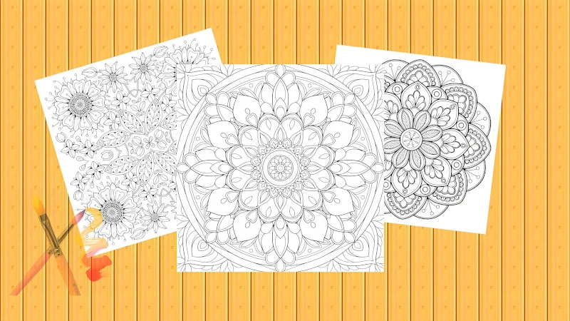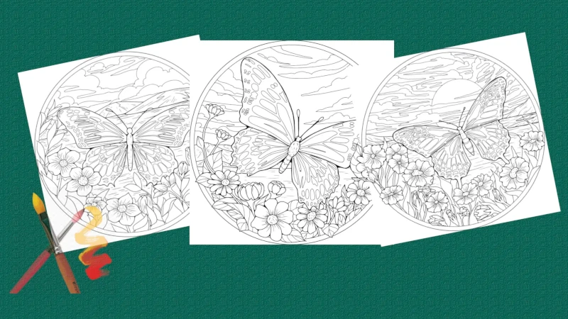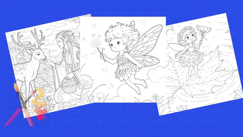
Choosing the right color combinations can transform your coloring pages from ordinary to extraordinary. Whether you're coloring a vibrant mandala, a serene landscape, or a playful animal scene, understanding how colors interact is key to creating harmonious and eye-catching artwork. Our professional designers have pre-colored thousands of pages with expert color schemes—explore our online coloring feature to follow guided color palettes with just a few taps!
Try Our Online Coloring Feature
Every coloring page on our site comes with a professionally colored example created by our design team. With our online coloring tool, you can:
- Follow numbered guides to replicate expert color combinations
- Experiment with color palettes before printing
- Save and share your digital masterpieces with one click
The Basics of Color Theory
Before diving into specific color combinations, it's helpful to understand the fundamentals of color theory. The color wheel is a foundational tool that shows the relationships between different colors. It consists of:
- Primary Colors: Red, blue, and yellow—the base colors from which all others are created.
- Secondary Colors: Orange, green, and purple—formed by mixing two primary colors.
- Tertiary Colors: Combinations of primary and secondary colors, such as red-orange, blue-green, and yellow-purple.
- Neutral Colors: Black, white, gray, and brown—often used as accents or to balance bold hues.
Understanding these relationships helps you create color combinations that are visually appealing and balanced. Let's explore some of the most popular color schemes and how to use them effectively in your coloring pages.
5 Essential Color Schemes for Coloring Pages
1. Complementary Colors: Bold and Contrasting
Complementary colors sit opposite each other on the color wheel, creating high contrast and visual energy. Examples include:
- Red & Green (perfect for holiday-themed pages)
- Blue & Orange (ideal for ocean or sunset scenes)
- Yellow & Purple (great for vibrant floral designs)
Pro Tip: Use one color as the dominant hue and the other as an accent to avoid an overwhelming effect. For example, color a flower primarily purple with yellow centers for a striking contrast.
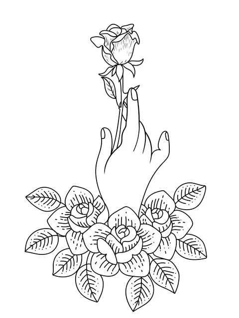
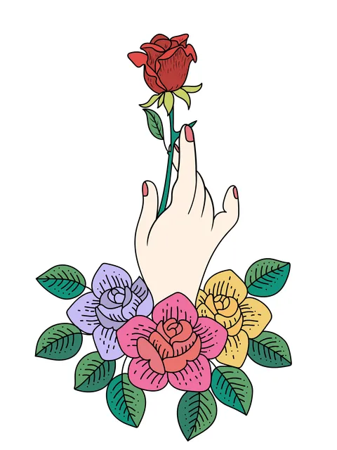
Follow the numbered guide to replicate this complementary color scheme
2. Analogous Colors: Harmonious and Calming
Analogous colors are adjacent on the color wheel, creating a soft, cohesive look. Examples include:
- Blue, Blue-Green, & Green (ideal for nature and forest scenes)
- Red, Red-Orange, & Orange (perfect for autumn leaves or fire-themed designs)
- Purple, Purple-Pink, & Pink (great for romantic or whimsical pages)
Pro Tip: Use a light shade of one color for backgrounds and darker shades of the adjacent colors for details. This creates depth without sacrificing harmony.
3. Monochromatic Colors: Sophisticated and Elegant
Monochromatic schemes use different shades, tints, and tones of a single color. For example:
- Light blue, medium blue, and dark blue (ideal for water scenes or winter landscapes)
- Soft pink, hot pink, and maroon (perfect for floral designs or romantic themes)
- Olive green, forest green, and teal (great for jungle or botanical pages)
Pro Tip: Add a neutral color like white or gray to lighten tints or black to deepen shades. This creates dimension while maintaining a cohesive palette.
4. Triadic Colors: Balanced and Vibrant
Triadic colors are evenly spaced on the color wheel, forming a triangle. Examples include:
- Red, Yellow, & Blue (primary triad for bold, playful designs)
- Orange, Green, & Purple (secondary triad for whimsical or fantasy pages)
- Teal, Magenta, & Gold (tertiary triad for bohemian or artistic styles)
Pro Tip: Choose one color as the main hue and use the others as accents. For example, color a mandala primarily teal with magenta and gold details.
5. Split-Complementary Colors: Subtle Contrast
Split-complementary schemes use a color and the two colors adjacent to its complement. For example:
- Blue (main color) with Yellow-Orange & Red-Orange (instead of direct complement orange)
- Red (main color) with Blue-Green & Yellow-Green (instead of direct complement green)
- Green (main color) with Red-Violet & Red-Orange (instead of direct complement red)
Pro Tip: This scheme offers high contrast without the intensity of traditional complementary colors, making it ideal for detailed designs that need visual interest without overwhelming the eye.
Color Combinations for Different Coloring Themes
1. Nature and Landscapes
For nature-themed pages, opt for earthy, calming palettes:
- Analogous greens and blues for forest and ocean scenes
- Monochromatic browns with green accents for woodland designs
- Warm yellows, oranges, and reds for sunset or autumn landscapes
2. Floral Designs
Flowers offer endless color possibilities:
- Pinks, purples, and whites for romantic roses
- Yellows and oranges for cheerful sunflowers
- Blues and purples for unique, fantasy-inspired flowers
- Complementary red and green for classic poinsettias
3. Mandalas and Abstract Patterns
Mandalas are perfect for bold, expressive color choices:
- Triadic color schemes for balanced, vibrant patterns
- Complementary colors for high-contrast, eye-catching designs
- Monochromatic gradients for sophisticated, modern mandalas
4. Animals and Creatures
Bring animals to life with realistic or whimsical colors:
- Earthy browns, tans, and whites for realistic wildlife
- Playful pinks, purples, and blues for fantasy creatures
- Black and white with a pop of color for dramatic effect (e.g., a black cat with green eyes)
Put Your Color Skills to the Test
Ready to experiment with color combinations? Explore our gallery of free printable coloring pages, designed to inspire your creativity. From nature scenes to abstract patterns, you'll find the perfect canvas for your color experiments.
Browse Coloring Pages Explore Themed CollectionsPractical Tips for Applying Color Combinations
1. Start with a Color Plan
Before picking up your coloring tools, sketch out a rough color plan. Use a color wheel or online color picker to experiment with combinations before committing to your page.
2. Use a Limited Palette
Limiting your palette to 3-5 main colors helps create a cohesive look. You can always add accents with neutral colors like black, white, or gray.
3. Consider the Mood
Think about the mood you want to convey. Warm colors (reds, oranges, yellows) evoke energy and happiness, while cool colors (blues, greens, purples) create calm and serenity.
4. Pay Attention to Values
Value refers to the lightness or darkness of a color. Mixing light and dark values creates depth and dimension. For example, use a light blue for sky and a darker blue for shadows.
5. Experiment and Have Fun
Don't be afraid to break the rules and experiment with unexpected combinations. The best way to learn is by practicing and discovering what works for you.
Recommended Tools for Perfect Color Combinations
Invest in high-quality coloring tools to achieve the best results. For a comprehensive guide on selecting and maintaining your art supplies, check out our article on Choosing and Caring for Your Coloring Tools.
- Colored Pencils: Prismacolor, Faber-Castell, or Derwent for smooth blending
- Markers: Copic or Tombow for vibrant, consistent color
- Watercolor Pencils: Perfect for creating soft, blended effects
- Blending Tools: Blending stumps, tortillons, or odorless mineral spirits for pencil blending
- Color Wheels: A physical or digital color wheel to help plan combinations
