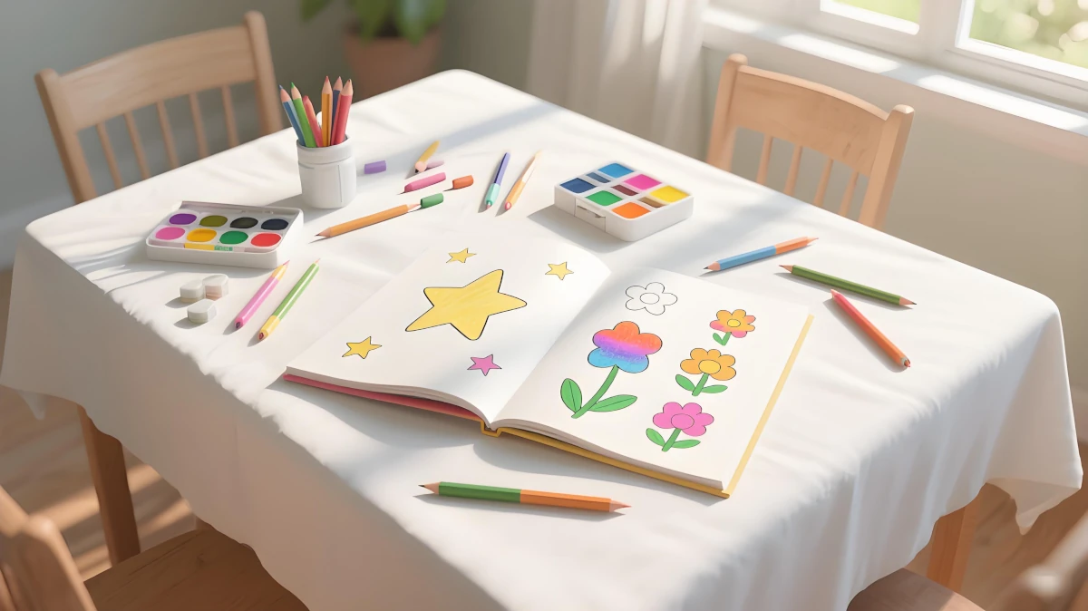
Embarking on your coloring journey can feel both exciting and overwhelming. Whether you're using traditional mediums like colored pencils, markers, or crayons, or exploring our digital coloring tools, mastering a few fundamental techniques will transform your artwork. In this guide, we'll cover essential skills for beginners, from basic shading to advanced blending, with step-by-step examples you can try right away.
Getting Started: Essential Tools for Beginners
Must-Have Coloring Tools
For a detailed breakdown of each tool and recommendations, check out our comprehensive guide: Choosing and Caring for Your Coloring Tools.
Great for control and layering. Choose a set with soft leads for smooth application.
Ideal for bold colors and flat fills. Opt for alcohol-based markers to avoid bleeding.
Blending stumps, tortillons, or even a tissue can help smooth color transitions.
Thicker paper or coloring books prevent ink from bleeding through.
5 Fundamental Coloring Techniques
1. Basic Coloring: Smooth and Even Fills
The foundation of all coloring techniques is learning to apply smooth, even layers of color. This technique is essential for creating a clean base for more advanced effects.

How to:
- Hold your tool at a 45-degree angle for better control.
- Use light, consistent strokes in one direction.
- Apply multiple thin layers rather than one heavy layer to avoid smudging.
- For digital coloring, use the "low opacity" setting for better control.
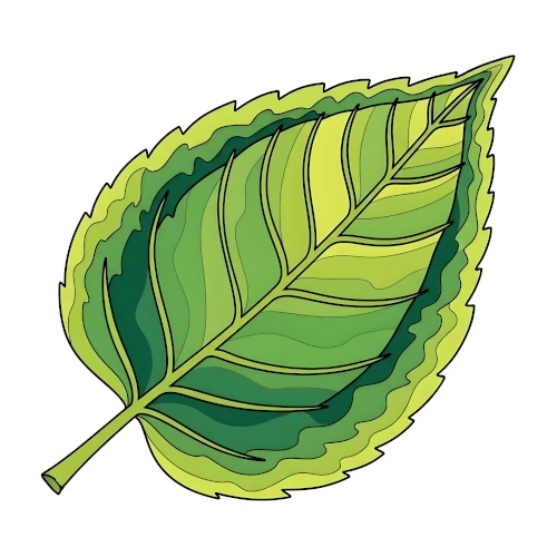
2. Shading: Adding Depth and Dimension
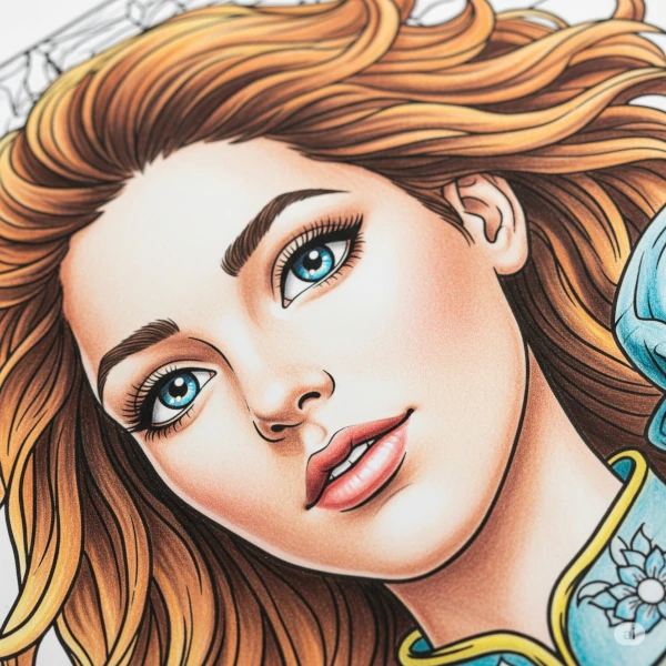
Shading is what transforms flat coloring into artwork with depth. By varying pressure and direction, you can create the illusion of light and shadow.
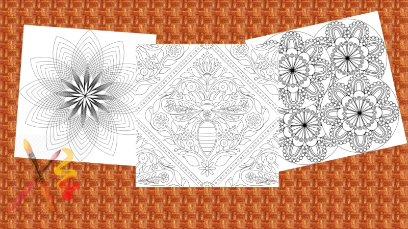
Try this online digital coloring work and feel the effect of shading.
How to:
- Identify your light source (usually from the top left).
- Apply light pressure for highlights (areas closest to the light).
- Increase pressure for shadows (areas furthest from the light).
- Use a blending tool to soften transitions between light and dark.
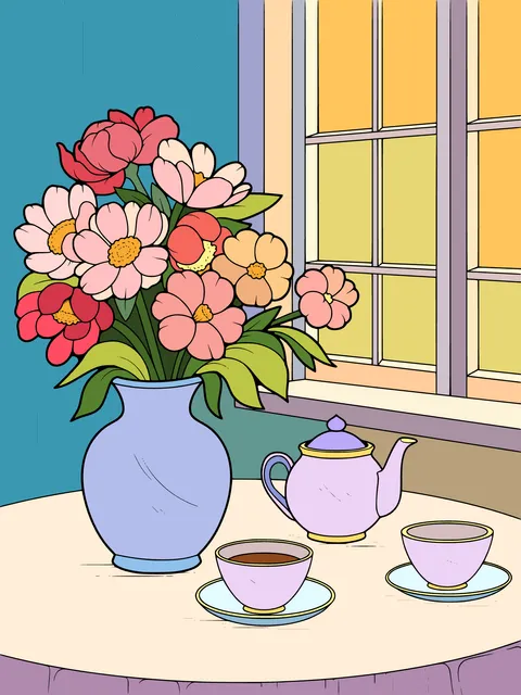
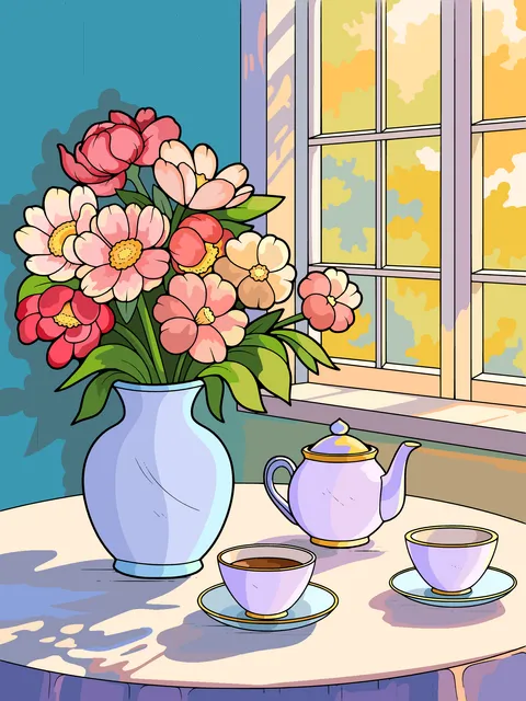
3. Blending: Creating Smooth Color Transitions
Blending combines multiple colors seamlessly, creating gradients or realistic effects. This technique is particularly useful for landscapes, skies, and skin tones.


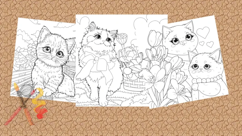
Try this online digital coloring work and feel the effect of shading.
How to:
- Choose two or more colors that complement each other.
- Color each section with light pressure, leaving some white space between.
- Use a blending tool (or a white pencil) to smooth the transition between colors.
- For digital blending, use the "blur" or "smudge" tool with low intensity.
4. Layering: Building Depth with Multiple Colors
Layering involves applying multiple colors on top of each other to create richness and complexity. This technique works especially well with colored pencils and digital tools.
How to:
- Start with a base color using light pressure.
- Add a second color in the same direction, focusing on areas that need depth.
- Repeat with additional colors, always allowing the previous layer to show through.
- Finish with a blending step to unify the layers.
5. Outlining: Defining Shapes with Precision
A well-executed outline can elevate your artwork by defining shapes and adding emphasis. This technique requires patience and steady hands.
How to:
- Choose a fine-tip tool that contrasts with your base color (e.g., black for light colors).
- Work slowly, following the contours of your design with consistent pressure.
- For digital outlining, use the "stabilizer" feature for smoother lines.
- For a professional touch, vary line thickness—use thicker lines for shadows and thinner for highlights.


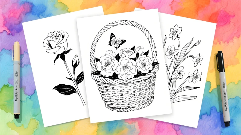
Try this online digital coloring work and feel the effect of shading.
Troubleshooting Common Beginner Mistakes
Even the most experienced artists started as beginners. Here's how to avoid common pitfalls:
Common Mistakes & Solutions
Solution: Use light pressure and build up layers. Heavy pressure can damage paper and make blending difficult.
Solution: Use marker paper or test colors on a scrap piece first. For digital tools, adjust opacity.
Solution: Use a ruler for straight lines or the "vector shape" tool in digital apps.
Solution: Limit blending to 2-3 colors at a time. Use complementary colors for contrast instead of mixing.
Next Steps: Practice Makes Perfect
The key to mastering these techniques is consistent practice. Start with simple shapes and gradually work your way up to more complex designs. And remember—there's no "right" or "wrong" way to color. The most important thing is to enjoy the process!